
UX/UI Cases
UX/UI & Graphic Designer
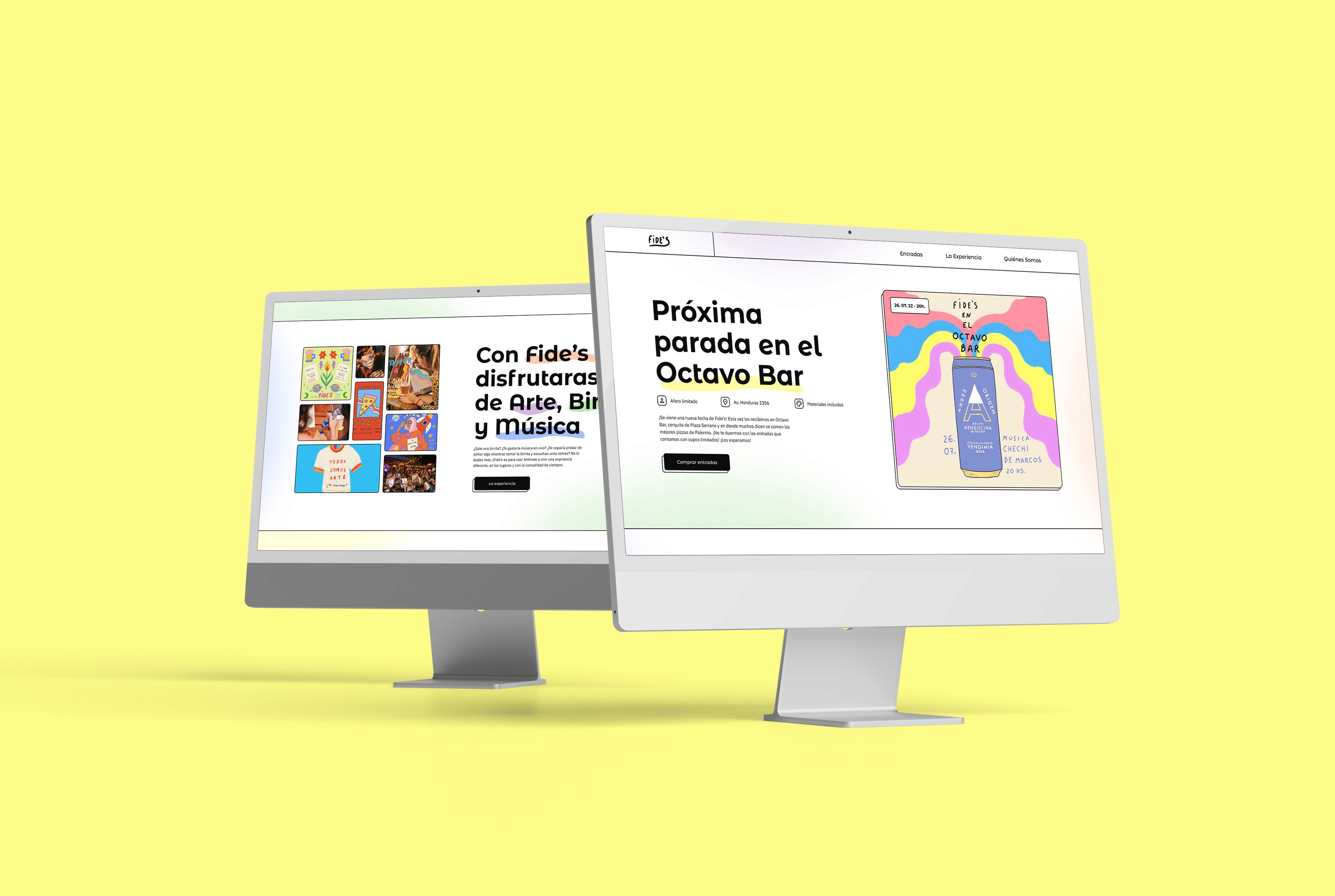
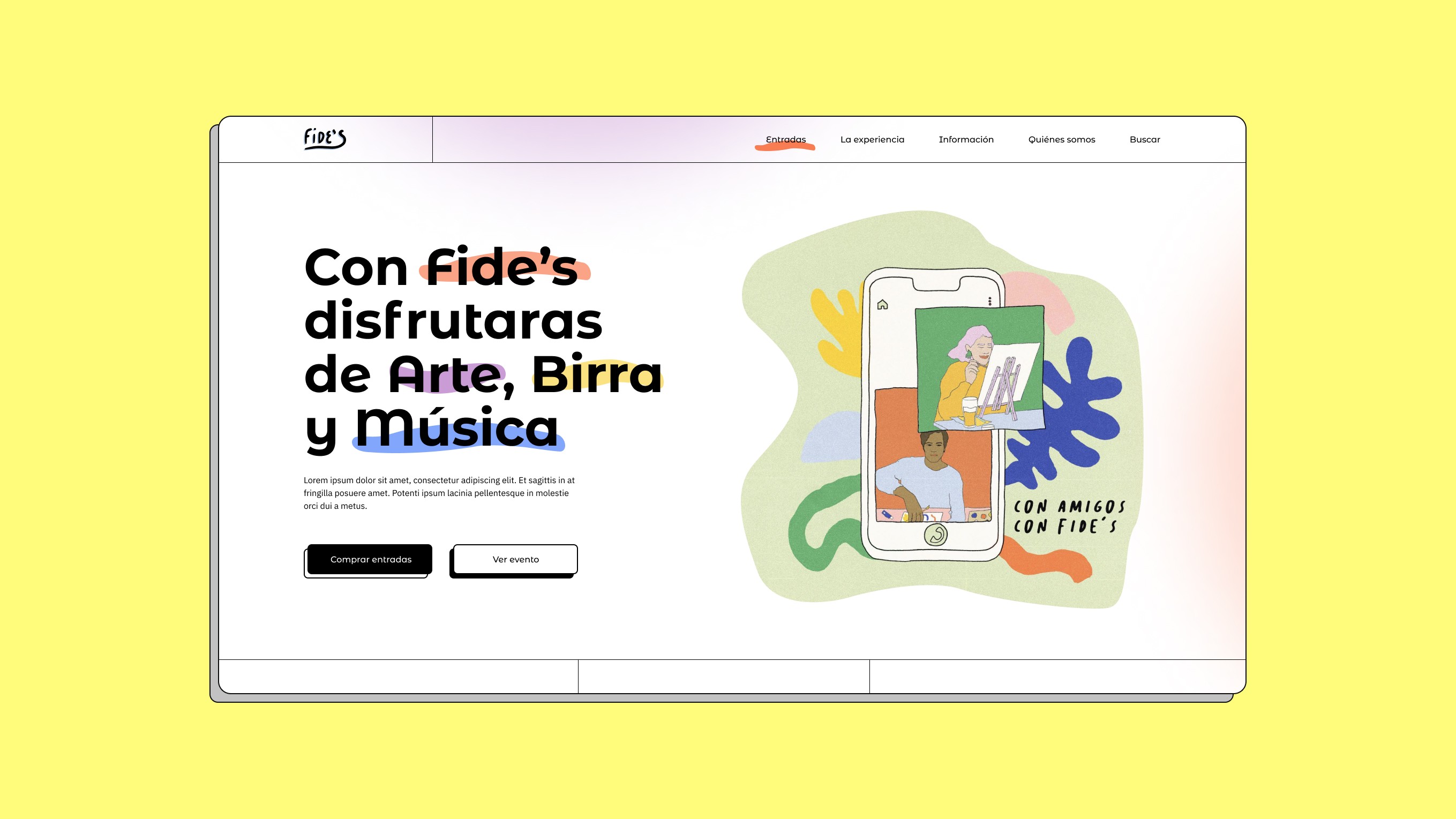
Fide's - Event microsite
Fide's: Painting, beer, friends and live music
Fide's is a recurring event that mixes art, music and beer in the city of Buenos Aires. The event is aimed at the general public, and it allow attendees to make some art of their own while listening to live music and drinking a beer with friend.
They were looking to design a website that allowed them to provide a clear view of the agenda and to sell tickets online. The site also contains plenty of information of the history of Fide's and their founders, as well as a photo gallery of the events.
Design Thinking
process
01
Empathize
Desktop Research | Interviews | Survey Canvas | Surveys
Competitive Analisys | Visual Competitive | Moodboard
02
Define
Affinity Diagram | User Persona | Empathy Map
User Journey | Problem Statement | Style Tile
03
Ideate
Hypothesis Statement | How Might We? | Moscow
04
Prototype
Site Map | Card Sorting | User Flow | Low Fi | Concept Testing | Mid Fi | Usability Testing | Hi Fi | Design System Interactions
Design Thinking
process
01
Empathize
Desktop Research | Interviews | Survey Canvas | Surveys | Competitive Analisys | Visual Competitive | Moodboard
02
Define
Affinity Diagram | User Persona | Empathy Map
User Journey | Problem Statement | Style Tile
03
Ideate
Hypothesis Statement | How Might We? | Moscow
04
Prototype
Site Map | Card Sorting | User Flow | Low Fi | Concept Testing | Mid Fi | Usability Testing | Hi Fi | Design System Interactions
Design Thinking
process
01
Empathize
Desktop Research | Interviews | Survey Canvas | Surveys
Competitive Analisys | Visual Competitive | Moodboard
02
Define
Affinity Diagram | User Persona | Empathy Map
User Journey | Problem Statement | Style Tile
03
Ideate
Hypothesis Statement | How Might We? | Moscow
04
Prototype
Site Map | Card Sorting | User Flow | Low Fi | Concept Testing | Mid Fi | Usability Testing | Hi Fi | Design System Interactions
Graphic Construction - Fide's
UX/UI & Graphic Designer

UX Research - Fide's
UX/UI & Graphic Designer
UX Research
UX Research
UX Research
UX Research
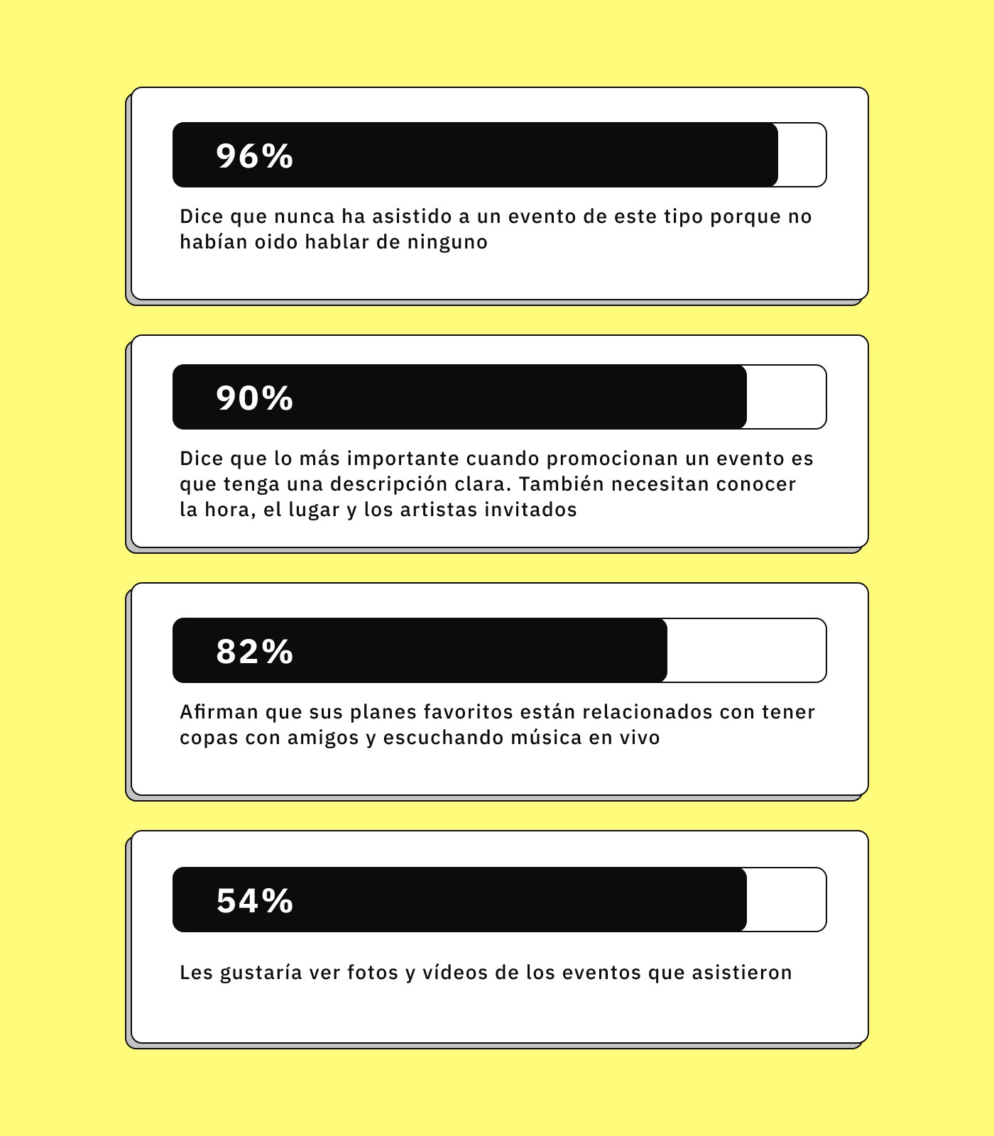
When conducting the research, we wanted to get to know which was the way that people searched and discovered new events and the information needed for them to feel comfortable enough to buy a ticket.
When conducting the research, we wanted to get to know which was the way that people searched and discovered new events and the information needed for them to feel comfortable enough to buy a ticket.
When conducting the research, we wanted to get to know which was the way that people searched and discovered new events and the information needed for them to feel comfortable enough to buy a ticket.
When conducting the research, we wanted to get to know which was the way that people searched and discovered new events and the information needed for them to feel comfortable enough to buy a ticket.
As a result of the information extracted from the interviews and surveys, we also had the opportunity to find out the needs most demanded by the users.
Affinity Diagram - Fide's
UX/UI & Graphic Designer
Affinity Diagram
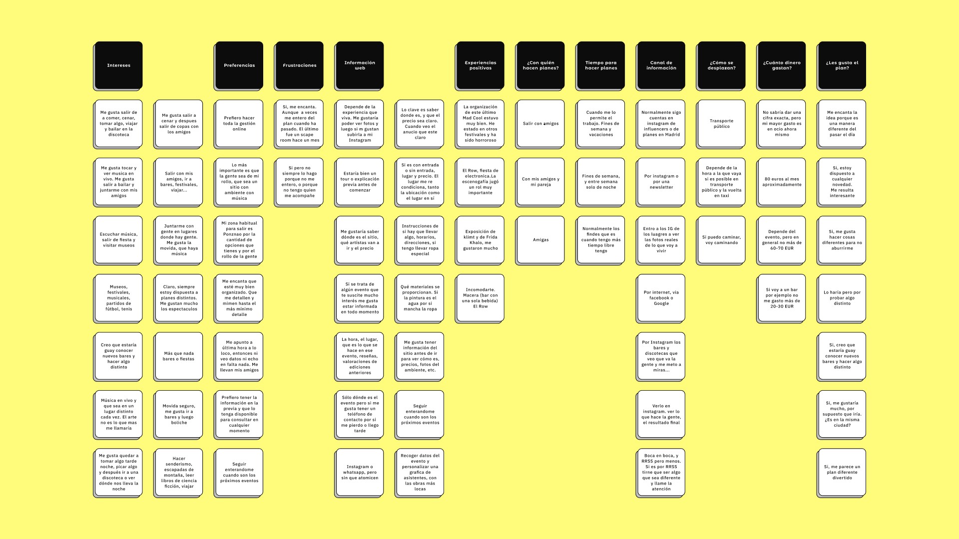
Below we collect all the ideas and comments from users. We organise and group all similar ideas together. From here we were able to identify into main categories, helping to identify patterns or relationships between ideas.
Affinity Diagram
Below we collect all the ideas and comments from users. We organise and group all similar ideas together. From here we were able to identify into main categories, helping to identify patterns or relationships between ideas.
Affinity Diagram
Below we collect all the ideas and comments from users. We organise and group all similar ideas together. From here we were able to identify into main categories, helping to identify patterns or relationships between ideas.
Affinity Diagram
Below we collect all the ideas and comments from users. We organise and group all similar ideas together. From here we were able to identify into main categories, helping to identify patterns or relationships between ideas.
Affinity Diagram
Below we collect all the ideas and comments from users. We organise and group all similar ideas together. From here we were able to identify into main categories, helping to identify patterns or relationships between ideas.
User Persona - Fide's
UX/UI & Graphic Designer
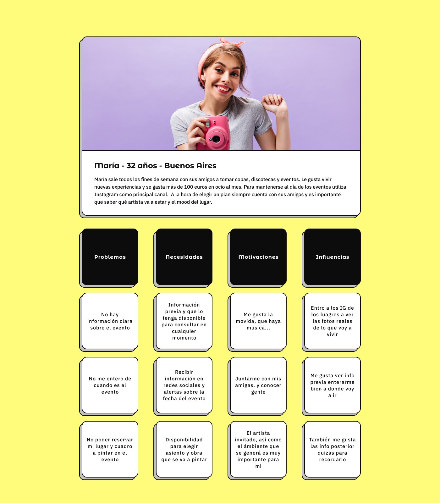
User Persona
User Persona
User Persona
User Persona
A User Persona was then created to help us define and understand our users, focusing on their needs, wants and behaviours.
A User Persona was then created to help us define and understand our users, focusing on their needs, wants and behaviours.
A User Persona was then created to help us define and understand our users, focusing on their needs, wants and behaviours.
A User Persona was then created to help us define and understand our users, focusing on their needs, wants and behaviours.
Our User Persona, Maria tells us that she likes to go out on weekends with her friends for drinks, discos and events. Most of the time she doesn't know about original events but when she finds an original plan it is not well described. He uses Instagram as his main channel to keep up to date with events.
Empathy Map - Fide's
UX/UI & Graphic Designer
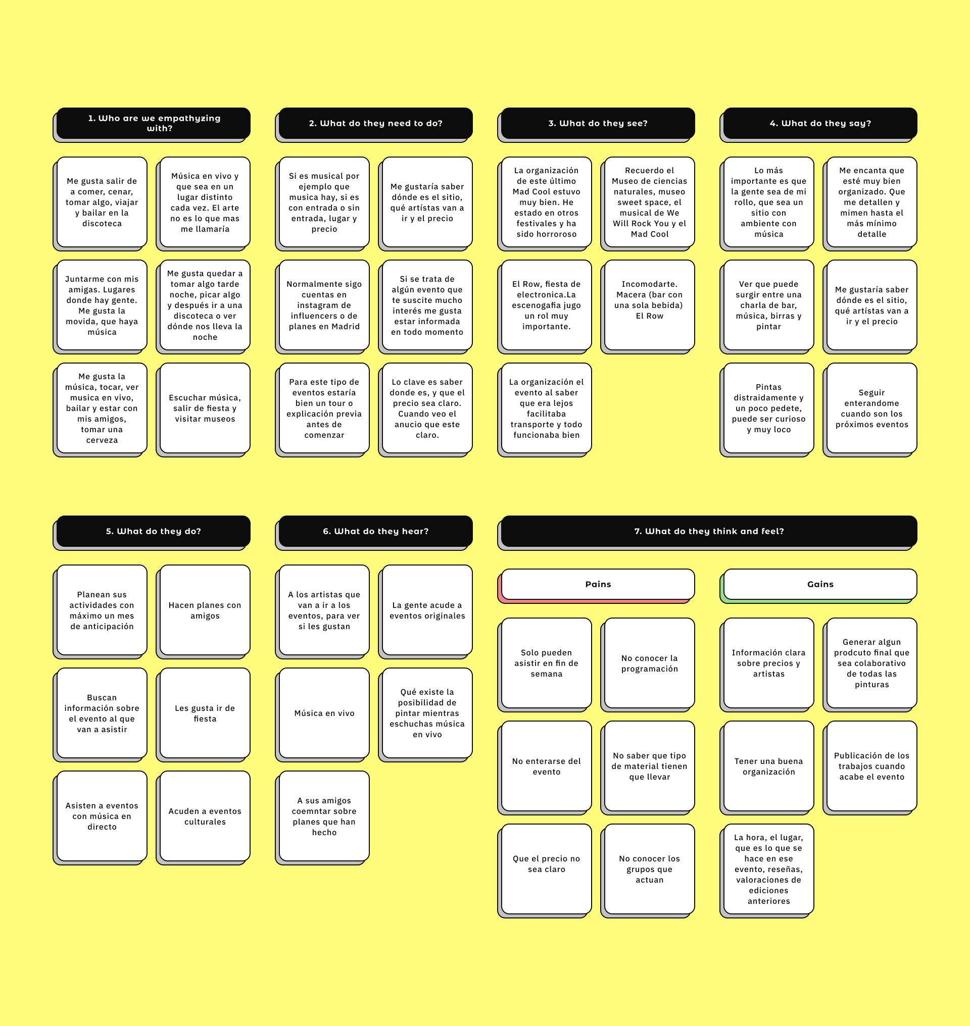
Empathy map
In order to organise and categorise the opinions and user comments that were extracted from the interviews and surveys, an Affinity Diagram was made. Several patterns and trends in the comments were identified and this helped to better understand the needs and wants of the users.
Empathy map
In order to organise and categorise the opinions and user comments that were extracted from the interviews and surveys, an Affinity Diagram was made. Several patterns and trends in the comments were identified and this helped to better understand the needs and wants of the users.
Empathy map
In order to organise and categorise the opinions and user comments that were extracted from the interviews and surveys, an Affinity Diagram was made. Several patterns and trends in the comments were identified and this helped to better understand the needs and wants of the users.
Empathy map
In order to organise and categorise the opinions and user comments that were extracted from the interviews and surveys, an Affinity Diagram was made. Several patterns and trends in the comments were identified and this helped to better understand the needs and wants of the users.
Empathy map
In order to organise and categorise the opinions and user comments that were extracted from the interviews and surveys, an Affinity Diagram was made. Several patterns and trends in the comments were identified and this helped to better understand the needs and wants of the users.
User Journey - Fide's
UX/UI & Graphic Designer
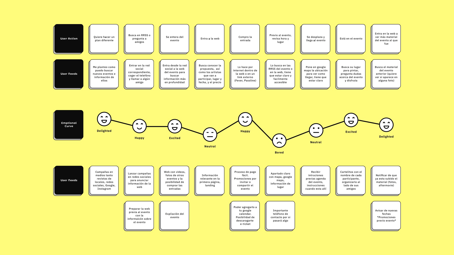
User Journey
In order to understand and analyse the problems faced by Maria in finding and purchasing tickets for an event similar to ours, we established her User Journey and located the friction points that would appear in the process of searching for and purchasing an event.
User Journey
In order to understand and analyse the problems faced by Maria in finding and purchasing tickets for an event similar to ours, we established her User Journey and located the friction points that would appear in the process of searching for and purchasing an event.
User Journey
In order to understand and analyse the problems faced by Maria in finding and purchasing tickets for an event similar to ours, we established her User Journey and located the friction points that would appear in the process of searching for and purchasing an event.
User Journey
In order to understand and analyse the problems faced by Maria in finding and purchasing tickets for an event similar to ours, we established her User Journey and located the friction points that would appear in the process of searching for and purchasing an event.
User Journey
In order to understand and analyse the problems faced by Maria in finding and purchasing tickets for an event similar to ours, we established her User Journey and located the friction points that would appear in the process of searching for and purchasing an event.
Problem and Hypothesis Statement - Fide's
UX/UI & Graphic Designer
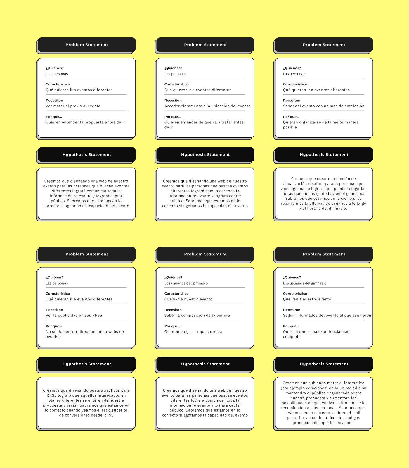
Problem and Hypothesis Statement
Problem and Hypothesis Statement
Problem and Hypothesis Statement
Problem and Hypothesis Statement
People looking for a new type of entertainment want to understand how the event works and see the content before they go. In addition, once they decide to attend, they want to secure their place online and easily.
People looking for a new type of entertainment want to understand how the event works and see the content before they go. In addition, once they decide to attend, they want to secure their place online and easily.
People looking for a new type of entertainment want to understand how the event works and see the content before they go. In addition, once they decide to attend, they want to secure their place online and easily.
People looking for a new type of entertainment want to understand how the event works and see the content before they go. In addition, once they decide to attend, they want to secure their place online and easily.
With these problems identified, a hypothesis was formulated to test and evaluate possible solutions and determine whether they effectively solved the identified problem.
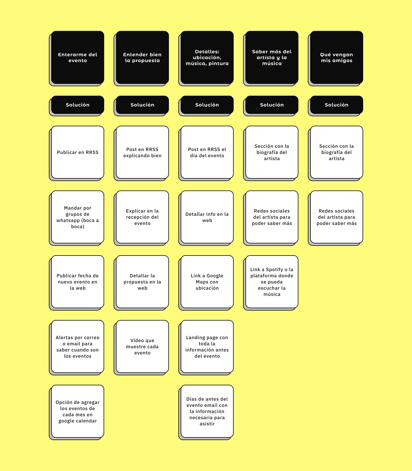
How Might We? - Fide's
UX/UI & Graphic Designer
How Might We?
How Might We?
How Might We?
How Might We?
Users find it difficult to find out about events similar to Fide's and to understand its proposition. How can we improve the experience for Fide's users?
Users find it difficult to find out about events similar to Fide's and to understand its proposition. How can we improve the experience for Fide's users?
Users find it difficult to find out about events similar to Fide's and to understand its proposition. How can we improve the experience for Fide's users?
Users find it difficult to find out about events similar to Fide's and to understand its proposition. How can we improve the experience for Fide's users?
This process invited to explore solutions to improve the event search and description experience for users, which could include improvements in the promotion, description and explanation of the event, as well as the possibility to continue the experience after the event has ended.
MoSCoW Prioritisation - Fide's
UX/UI & Graphic Designer
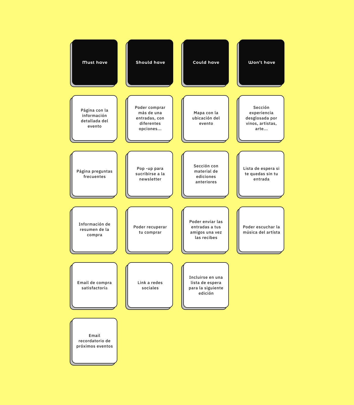
MoSCoW Prioritisation
MoSCoW Prioritisation
MoSCoW Prioritisation
MoSCoW Prioritisation
The result of the prioritisation method provides us with a prioritised list of features and functionalities that should be implemented on Fide's website.
The result of the prioritisation method provides us with a prioritised list of features and functionalities that should be implemented on Fide's website.
The result of the prioritisation method provides us with a prioritised list of features and functionalities that should be implemented on Fide's website.
The result of the prioritisation method provides us with a prioritised list of features and functionalities that should be implemented on Fide's website.
We then use this process as a guide to make decisions on which tasks should be addressed first and which can be postponed or discarded if necessary.
Competitive Analisys - Fide's
UX/UI & Graphic Designer
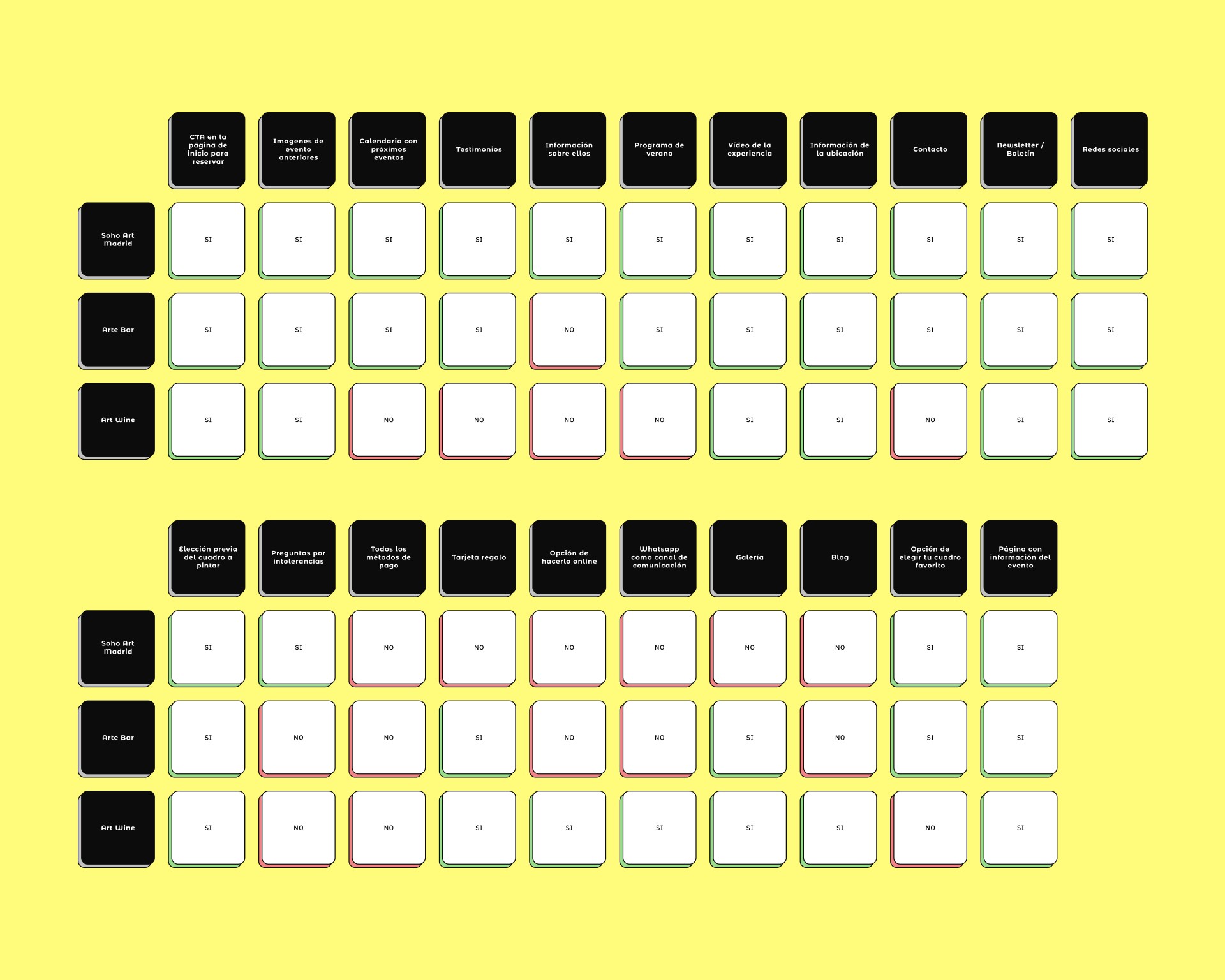
Competitive Analisys
The objective of the competitive analysis is to identify Fide's strengths and weaknesses compared to its competitors, as well as the opportunities and threats presented by the market.
Competitive Analisys
The objective of the competitive analysis is to identify Fide's strengths and weaknesses compared to its competitors, as well as the opportunities and threats presented by the market.
Competitive Analisys
The objective of the competitive analysis is to identify Fide's strengths and weaknesses compared to its competitors, as well as the opportunities and threats presented by the market.
Competitive Analisys
The objective of the competitive analysis is to identify Fide's strengths and weaknesses compared to its competitors, as well as the opportunities and threats presented by the market.
Competitive Analisys
The objective of the competitive analysis is to identify Fide's strengths and weaknesses compared to its competitors, as well as the opportunities and threats presented by the market.
User Flow - Fide's
UX/UI & Graphic Designer
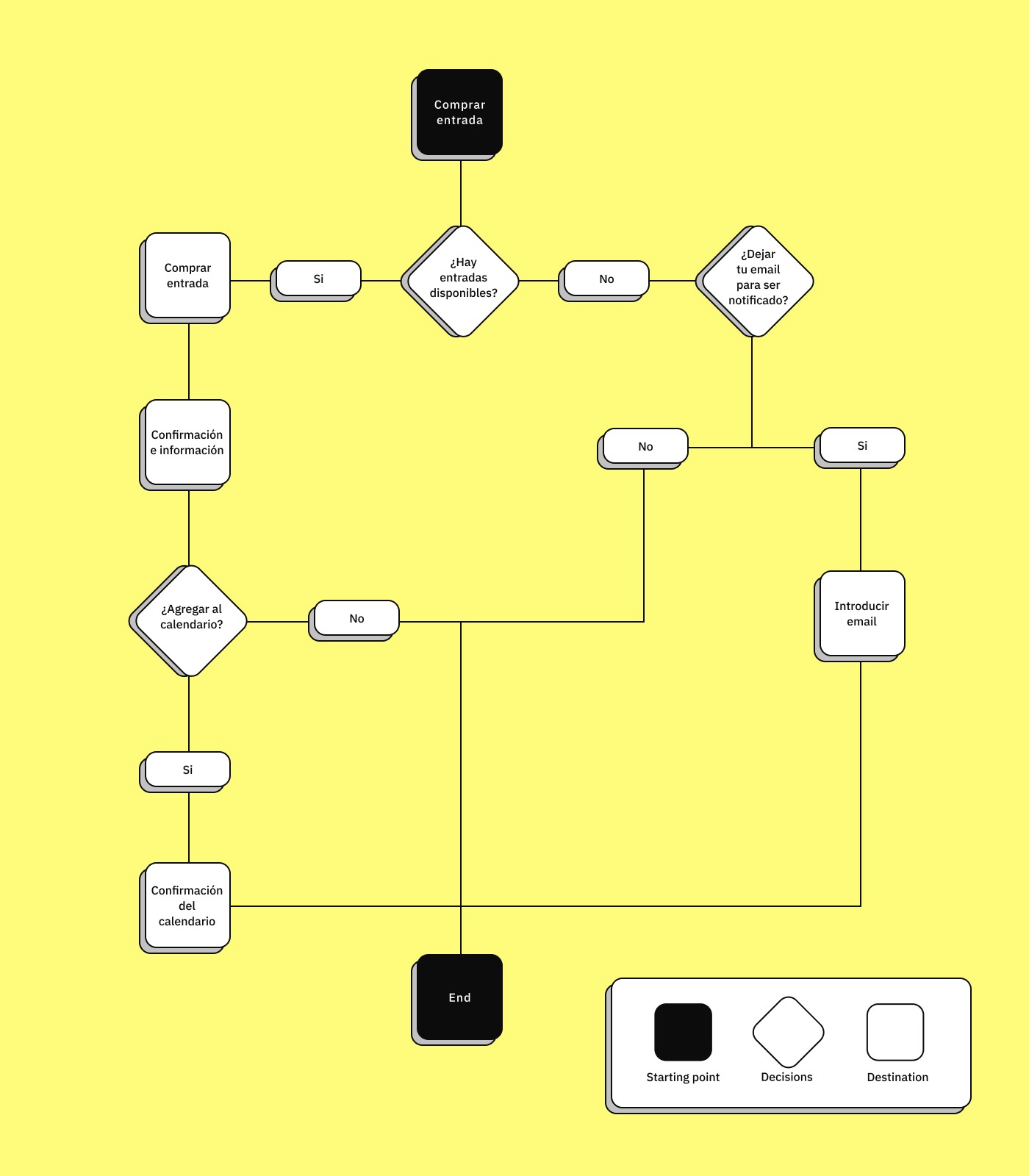
User Flow
User Flow
User Flow
User Flow
Below we can see one of the main flows that our users have to follow, in concrete terms this flow represents the flow that our user has to follow when having to buy a ticket for a Fide's event.
Below we can see one of the main flows that our users have to follow, in concrete terms this flow represents the flow that our user has to follow when having to buy a ticket for a Fide's event.
Below we can see one of the main flows that our users have to follow, in concrete terms this flow represents the flow that our user has to follow when having to buy a ticket for a Fide's event.
Below we can see one of the main flows that our users have to follow, in concrete terms this flow represents the flow that our user has to follow when having to buy a ticket for a Fide's event.
In this presentation, we will show you how we have designed the user flow to guide users through the website in an efficient and intuitive way. In addition, we will give you a detailed overview of how we have addressed potential obstacles and interruptions to ensure a successful user experience.
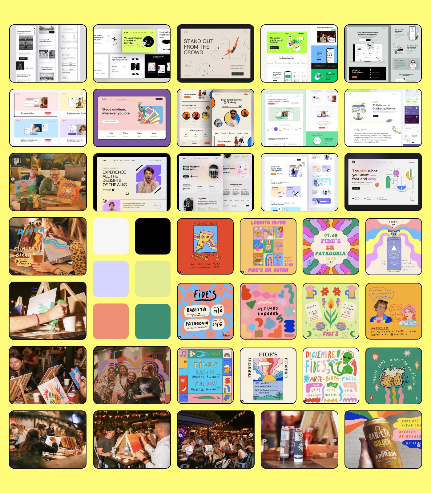
Moodboard - Fide's
UX/UI & Graphic Designer
Moodboard
Moodboard
Moodboard
Moodboard
In our moodboard we show how we have captured the essence and visual direction of the project through images, colours, typography and other visual elements.
In our moodboard we show how we have captured the essence and visual direction of the project through images, colours, typography and other visual elements.
In our moodboard we show how we have captured the essence and visual direction of the project through images, colours, typography and other visual elements.
In our moodboard we show how we have captured the essence and visual direction of the project through images, colours, typography and other visual elements.
In this presentation we have compiled images, colours, fonts and other visual elements to create a visual representation of the direction and essence of our project. We hope this presentation will give you a clear understanding of how we have approached the visual direction of our project and give you a detailed insight into our ideas and objectives.

Sitemap
Sitemap
Sitemap
Sitemap
Below we can see how we have organised and structured the content and navigation of Fide's website and ensure a satisfactory user experience.
Below we can see how we have organised and structured the content and navigation of Fide's website and ensure a satisfactory user experience.
Below we can see how we have organised and structured the content and navigation of Fide's website and ensure a satisfactory user experience.
Below we can see how we have organised and structured the content and navigation of Fide's website and ensure a satisfactory user experience.
We have been able to develop this sitemap using a card sorting process that helped us to organise the contents and sections of the website. You can see how we have sorted and organised the content into relevant categories and provided a detailed overview of the navigation structure.
Style Tile - Fide's
UX/UI & Graphic Designer
Style Tile
A style tile allowed us to define and communicate the style and aesthetic of the Fide's website. In this way, it was possible to communicate the visual direction of the project, facilitate design decision making, and establish visual consistency throughout the project.
Style Tile
A style tile allowed us to define and communicate the style and aesthetic of the Fide's website. In this way, it was possible to communicate the visual direction of the project, facilitate design decision making, and establish visual consistency throughout the project.
Style Tile
A style tile allowed us to define and communicate the style and aesthetic of the Fide's website. In this way, it was possible to communicate the visual direction of the project, facilitate design decision making, and establish visual consistency throughout the project.
Style Tile
A style tile allowed us to define and communicate the style and aesthetic of the Fide's website. In this way, it was possible to communicate the visual direction of the project, facilitate design decision making, and establish visual consistency throughout the project.
Style Tile
A style tile allowed us to define and communicate the style and aesthetic of the Fide's website. In this way, it was possible to communicate the visual direction of the project, facilitate design decision making, and establish visual consistency throughout the project.
Foundations - Fide's
UX/UI & Graphic Designer

Foundations
01
Typography
For this project two totally different typographic styles have been chosen, on the one hand there is the Montserrat Alternates typeface because it evokes the old posters and signs of the traditional neighbourhood of Montserrat in Buenos Aires. It is a font that rescues the beauty of the urban typography that emerged in the first half of the 20th century. This typeface is used for headlines and text elements to be highlighted.
On the other hand we have the IBM Plex Sans, with this typographic choice we wanted a grotesque style font that was neutral but friendly to be read on any device. This style is mainly used for paragraphs and texts that do not need to be highlighted.
02
Colors
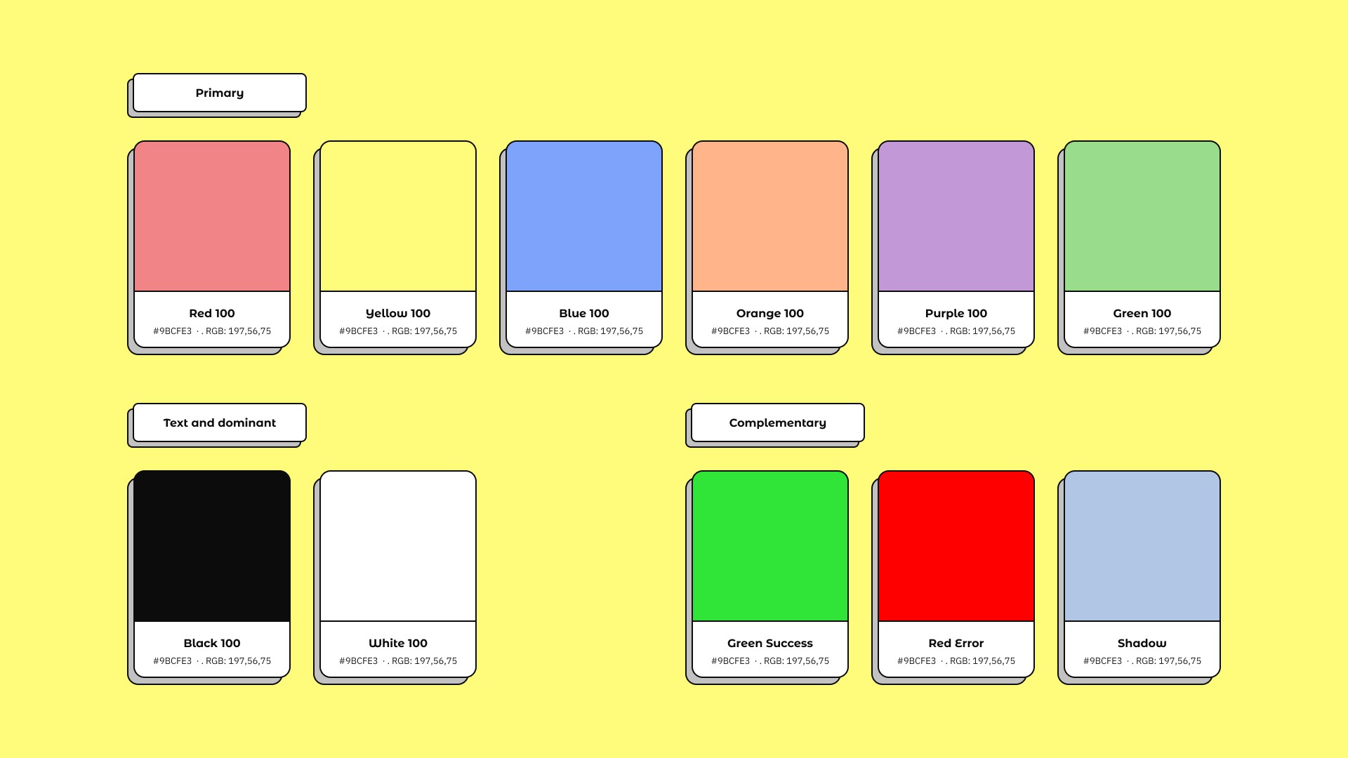
It can be said that this project seeks to provide an image of clarity and cleanliness, giving prominence to the powerful and colourful illustrations that promote Fide's events. Therefore, white has been chosen as the dominant tone of the website to provide this cleanliness, accompanied by black, which is used in the texts.
A series of colours have been chosen to complement the previous ones, these colours would add a touch of colour to the design, in this case we have chosen an adaptation of primary and secondary colours adapted to Fide's tones.
Foundations
01
Typography
For this project two totally different typographic styles have been chosen, on the one hand there is the Montserrat Alternates typeface because it evokes the old posters and signs of the traditional neighbourhood of Montserrat in Buenos Aires. It is a font that rescues the beauty of the urban typography that emerged in the first half of the 20th century. This typeface is used for headlines and text elements to be highlighted.
On the other hand we have the IBM Plex Sans, with this typographic choice we wanted a grotesque style font that was neutral but friendly to be read on any device. This style is mainly used for paragraphs and texts that do not need to be highlighted.
02
Colors
It can be said that this project seeks to provide an image of clarity and cleanliness, giving prominence to the powerful and colourful illustrations that promote Fide's events. Therefore, white has been chosen as the dominant tone of the website to provide this cleanliness, accompanied by black, which is used in the texts.
A series of colours have been chosen to complement the previous ones, these colours would add a touch of colour to the design, in this case we have chosen an adaptation of primary and secondary colours adapted to Fide's tones.
Design System - Fide's
UX/UI & Graphic Designer
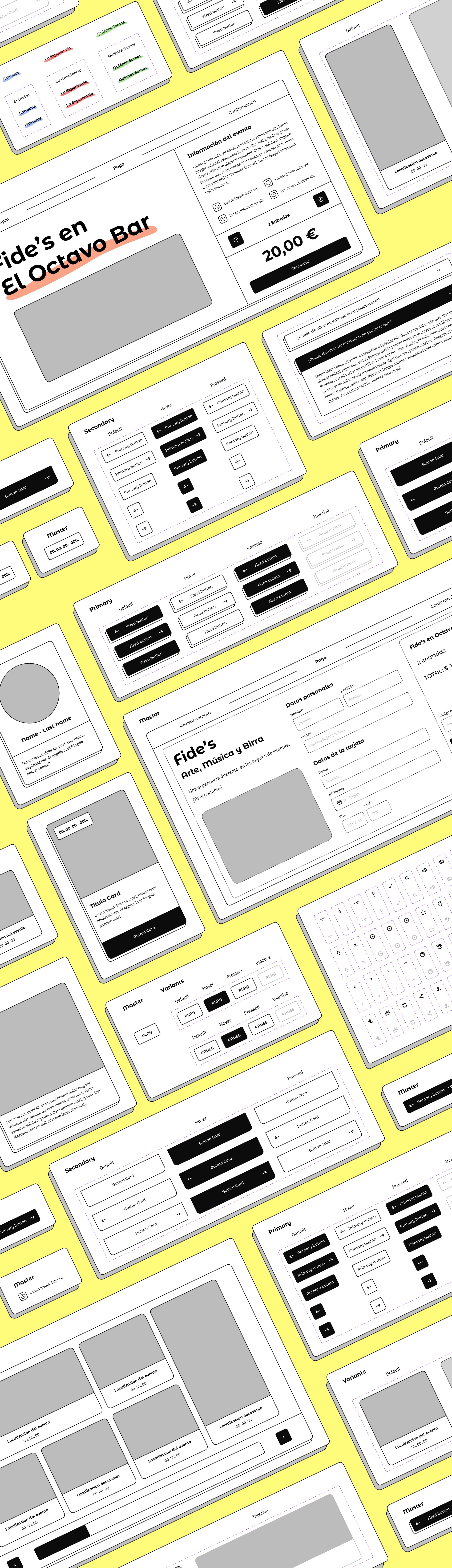
Design System
The goal of creating the Design System is to generate visual and user experience consistency in this product, improve design and development efficiency, reduce design errors, and improve product quality.
Design System
The goal of creating the Design System is to generate visual and user experience consistency in this product, improve design and development efficiency, reduce design errors, and improve product quality.
Design System
The goal of creating the Design System is to generate visual and user experience consistency in this product, improve design and development efficiency, reduce design errors, and improve product quality.
Design System
The goal of creating the Design System is to generate visual and user experience consistency in this product, improve design and development efficiency, reduce design errors, and improve product quality.
Design System
The goal of creating the Design System is to generate visual and user experience consistency in this product, improve design and development efficiency, reduce design errors, and improve product quality.
UX/UI Cases
UX/UI & Graphic Designer
Pick another case
Pick another case
Pick another case
Pick another case
Pick another case
Contact me
UX/UI & Graphic Designer


Jacobo García Peñalver
UX/UI & Graphic Designer
