UX/UI Cases
UX/UI & Graphic Designer
Rafael Guastavino - Editorial website
Rafael Guastavino:
Tribute to the
New York architect
The project consists of designing a responsive website, which includes a desktop and mobile version. The main objective of this website is to disseminate the work of Rafael Guastavino.
Rafael Guastavino - Editorial website
Rafael Guastavino:
Tribute to the
New York architect
The project consists of designing a responsive website, which includes a desktop and mobile version. The main objective of this website is to disseminate the work of Rafael Guastavino.
Rafael Guastavino - Editorial website
Rafael Guastavino:
Tribute to the
New York architect
The project consists of designing a responsive website, which includes a desktop and mobile version. The main objective of this website is to disseminate the work of Rafael Guastavino.
Rafael Guastavino - Editorial website
Rafael Guastavino:
Tribute
to the
New York architect
The project consists of designing a responsive website, which includes a desktop and mobile version. The main objective of this website is to disseminate the work of Rafael Guastavino.
Rafael Guastavino - Editorial website
Rafael Guastavino:
Tribute to the
New York architect
The project consists of designing a responsive website, which includes a desktop and mobile version. The main objective of this website is to disseminate the work of Rafael Guastavino.
Design Thinking Process - Rafael Guastavino
UX/UI & Graphic Designer
Design Thinking
Process
01
Empathize
Desktop Research | Moodboard
02
Define
User Persona | Style Tile
03
Prototype
Low Fi | Mid Fi | Hi Fi | Design System Interactions
Design Thinking
Process
01
Empathize
Desktop Research | Moodboard
02
Define
User Persona | Style Tile
03
Prototype
Low Fi | Mid Fi | Hi Fi | Design System Interactions
Design Thinking
Process
01
Empathize
Desktop Research | Interviews | Survey Canvas | Surveys | Competitive Analisys | Visual Competitive | Moodboard
02
Define
User Persona | Style Tile
03
Prototype
Low Fi | Mid Fi | Hi Fi | Design System Interactions
Design Thinking
Process
01
Empathize
Desktop Research | Moodboard
02
Define
User Persona | Style Tile
03
Prototype
Low Fi | Mid Fi | Hi Fi | Design System Interactions
Design Thinking
Process
01
Empathize
Desktop Research | Moodboard
02
Define
User Persona | Style Tile
03
Prototype
Low Fi | Mid Fi | Hi Fi | Design System Interactions
Prototype - Rafael Guastavino
UX/UI & Graphic Designer
Prototype
The entire website design has been created in Figma and animated in After Effects due to the complexity of the animations included in the project.
Prototype
Not just timeless and memorable, but usable in todays digital world.
By using my expertise as a digital designer, I make sure that a visual identity can be used throughout all digital touchpoints in an accessible and user-friendly way.
Prototype
The entire website design has been created in Figma and animated in After Effects due to the complexity of the animations included in the project.
Prototype
The entire website design has been created in Figma and animated in After Effects due to the complexity of the animations included in the project.
Prototype
The entire website design has been created in Figma and animated in After Effects due to the complexity of the animations included in the project.
Prototype - Rafael Guastavino
UX/UI & Graphic Designer

User Persona - Rafael Guastavino
UX/UI & Graphic Designer
User Persona
User Persona
User Persona
User Persona
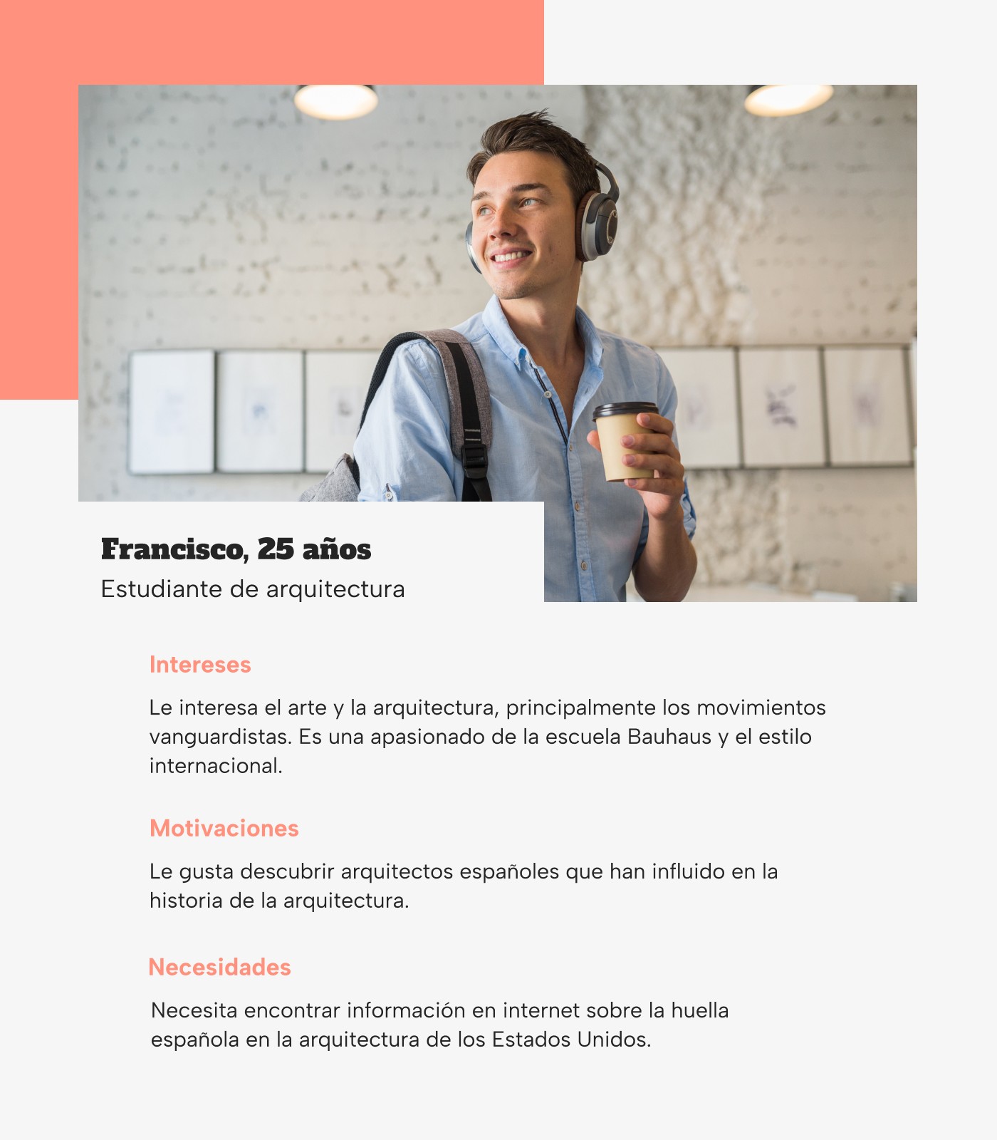
In the first place, to start the project, a series of interviews have been carried out to define the User Persona that will help us start the project.
In the first place, to start the project, a series of interviews have been carried out to define the User Persona that will help us start the project.
In the first place, to start the project, a series of interviews have been carried out to define the User Persona that will help us start the project.
In the first place, to start the project, a series of interviews have been carried out to define the User Persona that will help us start the project.
Our User Persona, Francisco, is interested in art and architecture, mainly avant-garde movements. He likes to discover new artistic and architectural trends. He finds it difficult to find the Spanish imprint in the architecture of the United States of America.
Our User Persona, Francisco, is interested in art and architecture, mainly avant-garde movements. He likes to discover new artistic and architectural trends. He finds it difficult to find the Spanish imprint in the architecture of the United States of America.
Moodboard - Rafael Guastavino
UX/UI & Graphic Designer
Moodboard
Moodboard
Moodboard
Moodboard
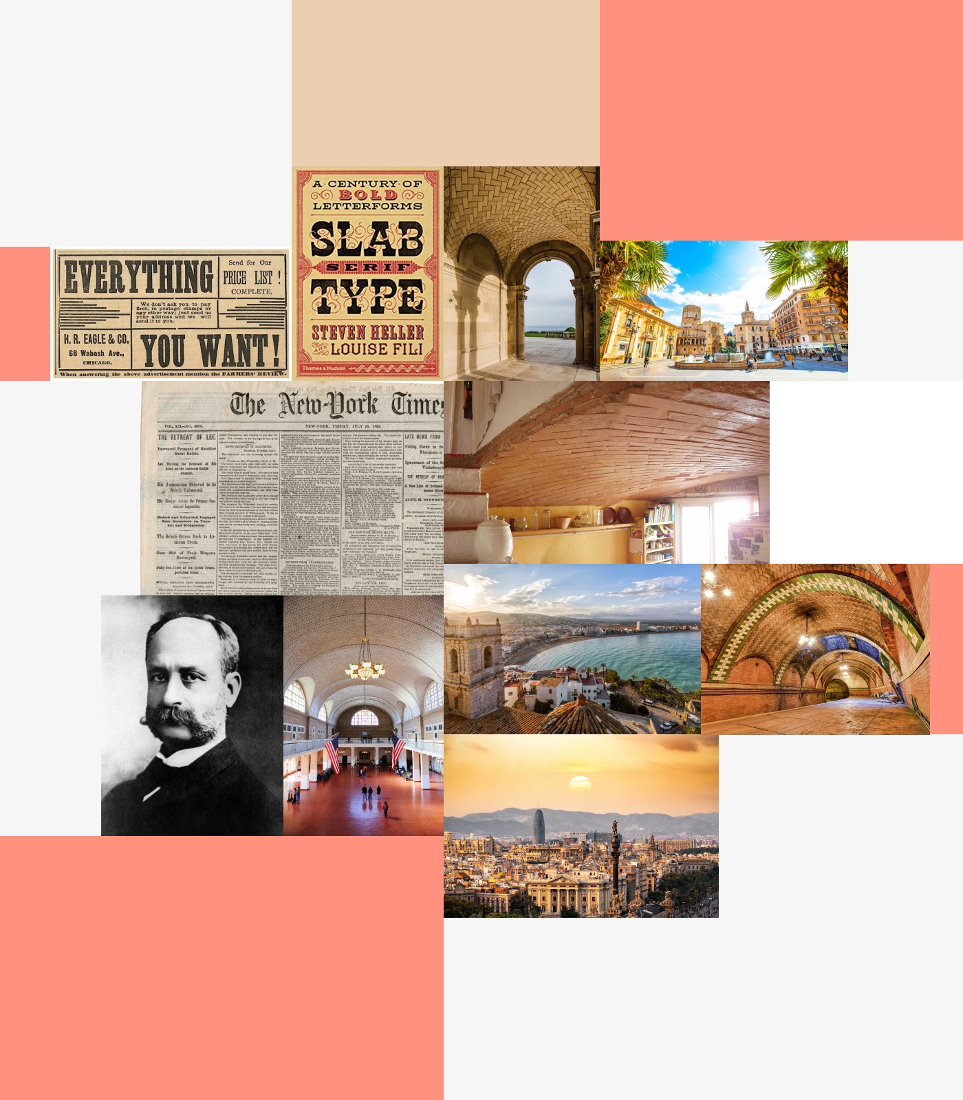
The main references taken as inspiration have been 19th century newspapers and posters. In addition, on the other hand, there are constructions with vaulted ceilings, buildings by Rafael Guastavino and Mediterranean cities such as Barcelona and Valencia, two cities strongly linked to the character.
The main references taken as inspiration have been 19th century newspapers and posters. In addition, on the other hand, there are constructions with vaulted ceilings, buildings by Rafael Guastavino and Mediterranean cities such as Barcelona and Valencia, two cities strongly linked to the character.
The main references taken as inspiration have been 19th century newspapers and posters. In addition, on the other hand, there are constructions with vaulted ceilings, buildings by Rafael Guastavino and Mediterranean cities such as Barcelona and Valencia, two cities strongly linked to the character.
The main references taken as inspiration have been 19th century newspapers and posters. In addition, on the other hand, there are constructions with vaulted ceilings, buildings by Rafael Guastavino and Mediterranean cities such as Barcelona and Valencia, two cities strongly linked to the character.
Foundations - Rafael Guastavino
UX/UI & Graphic Designer
Foundations
01
Typography
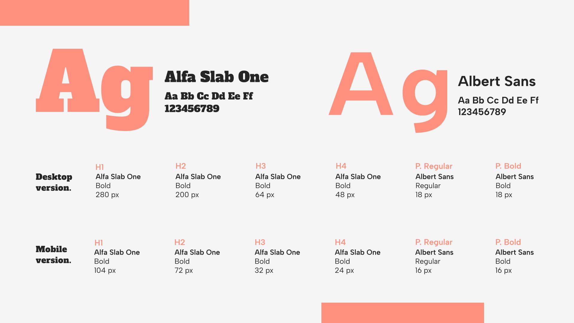
Two clearly differentiated typographic styles are extracted from the moodboard. Firstly, the Alfa Slab One typeface has been selected, in Egyptian or slab style, to be used in headlines. Secondly, the Albert Sans sans serif typeface family has been chosen, which is used for paragraphs, making it easier to read on screen.
02
Colors
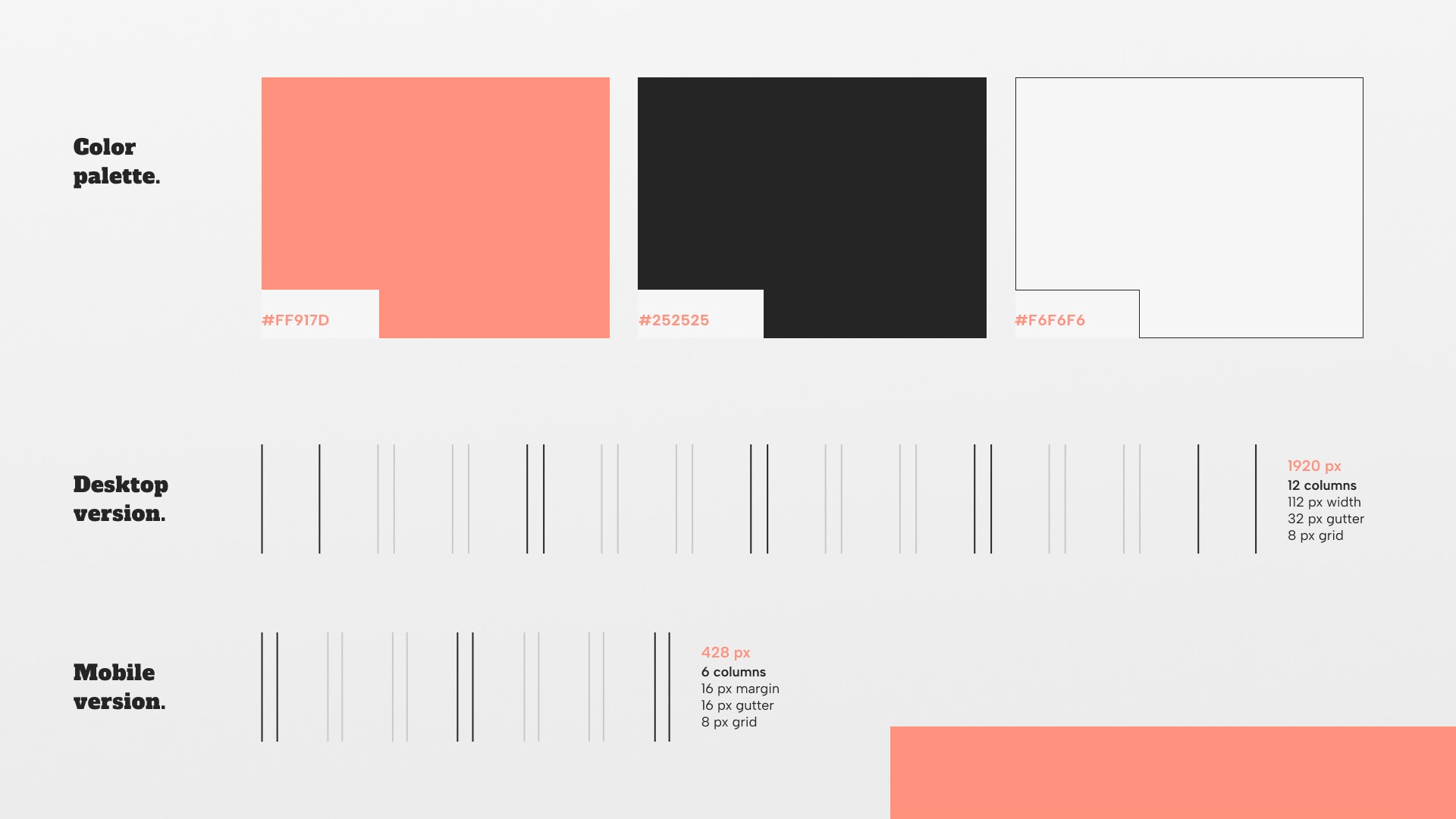
The three colours selected for the design have been taken from the moodboard. Terracotta, black and grey.
03
Layout
The layout, both desktop and mobile, has been built on a base of 8 px growing proportionally in multiplies of 8.
Foundations
01
Typography
Two clearly differentiated typographic styles are extracted from the moodboard. Firstly, the Alfa Slab One typeface has been selected, in Egyptian or slab style, to be used in headlines. Secondly, the Albert Sans sans serif typeface family has been chosen, which is used for paragraphs, making it easier to read on screen.
02
Colors
The three colours selected for the design have been taken from the moodboard. Terracotta, black and grey.
03
Layout
The layout, both desktop and mobile, has been built on a base of 8 px growing proportionally in multiplies of 8.
Desktop Layout - Rafael Guastavino
UX/UI & Graphic Designer
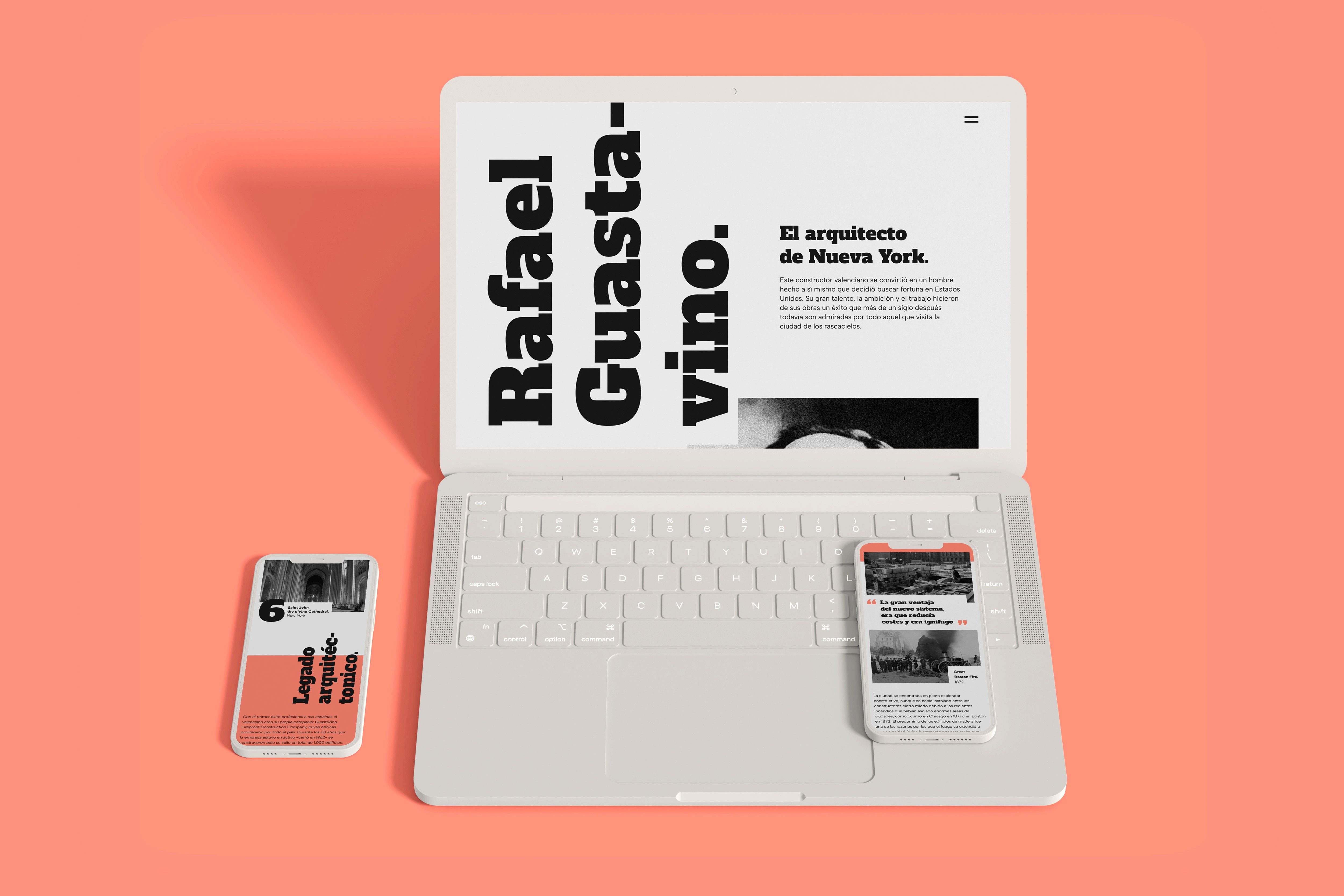
Desktop Layout
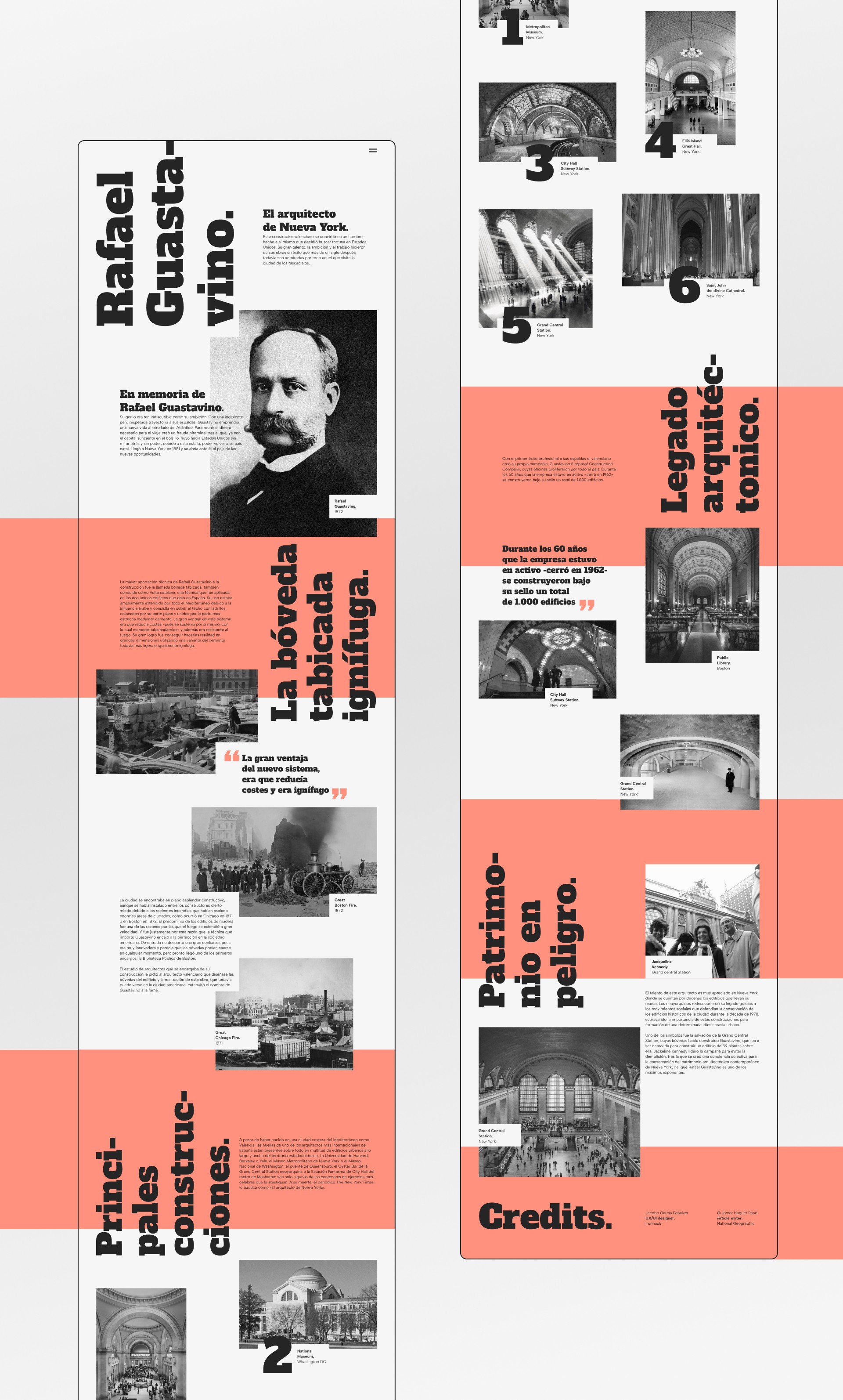
The project is built in an attempt to imitate the constructive method of the Catalan vault. The elements that make up the design fit together, giving rise to a well-established layout that is capable of evoking the architecture itself.
Desktop Layout
Not just timeless and memorable, but usable in todays digital world.
By using my expertise as a digital designer, I make sure that a visual identity can be used throughout all digital touchpoints in an accessible and user-friendly way.
Desktop Layout
The project is built in an attempt to imitate the constructive method of the Catalan vault. The elements that make up the design fit together, giving rise to a well-established layout that is capable of evoking the architecture itself.
Desktop Layout
The project is built in an attempt to imitate the constructive method of the Catalan vault. The elements that make up the design fit together, giving rise to a well-established layout that is capable of evoking the architecture itself.
Desktop Layout
The project is built in an attempt to imitate the constructive method of the Catalan vault. The elements that make up the design fit together, giving rise to a well-established layout that is capable of evoking the architecture itself.
Mobile Layout - Rafael Guastavino
UX/UI & Graphic Designer

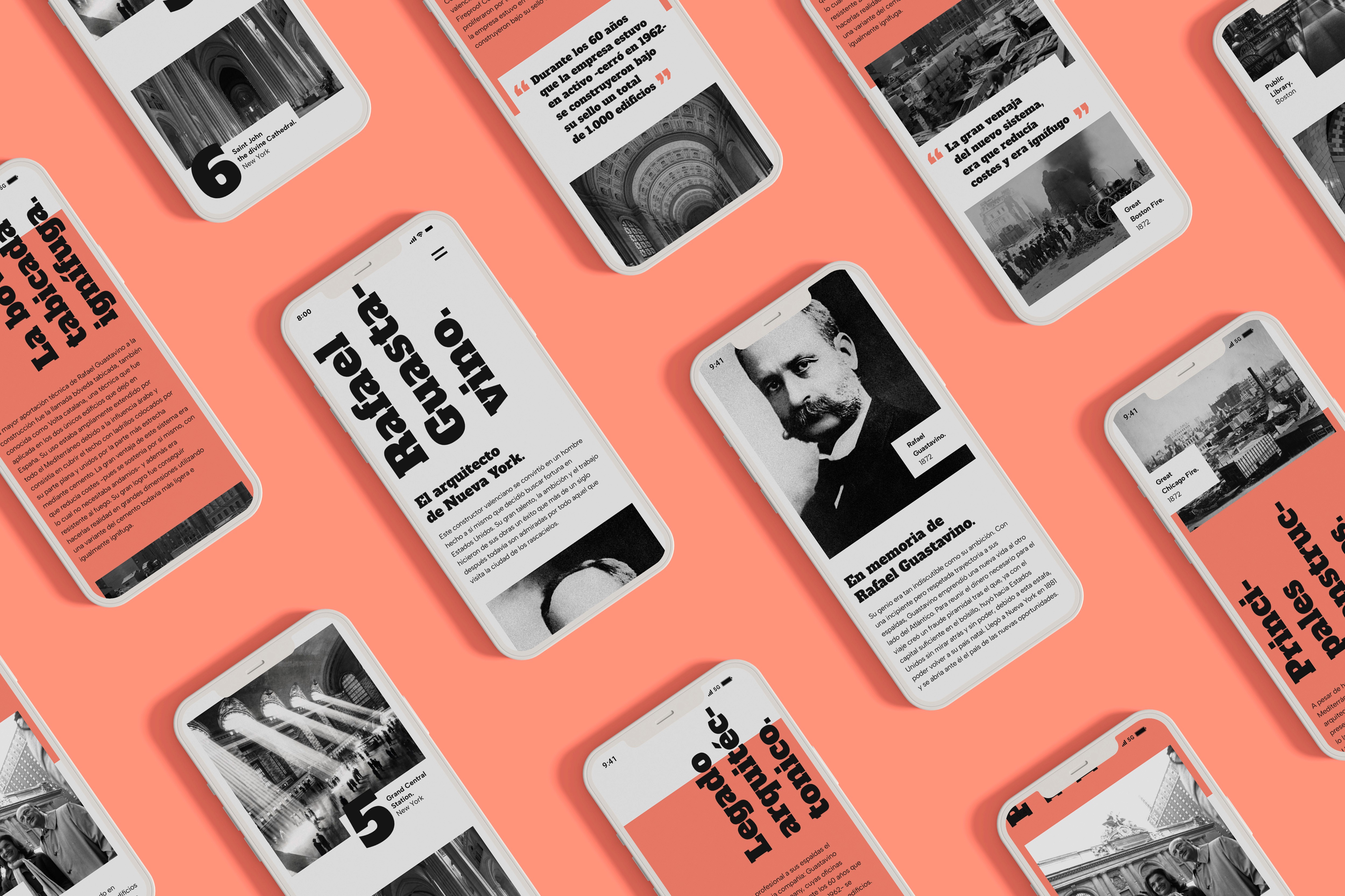
Mobile Layout
As a further development of the project, a mobile version has been created. In this version, all the elements have been adjusted and relocated to adapt them to this format.
Mobile Layout
Not just timeless and memorable, but usable in todays digital world.
By using my expertise as a digital designer, I make sure that a visual identity can be used throughout all digital touchpoints in an accessible and user-friendly way.
Mobile Layout
As a further development of the project, a mobile version has been created. In this version, all the elements have been adjusted and relocated to adapt them to this format.
Mobile Layout
As a further development of the project, a mobile version has been created. In this version, all the elements have been adjusted and relocated to adapt them to this format.
Mobile Layout
As a further development of the project, a mobile version has been created. In this version, all the elements have been adjusted and relocated to adapt them to this format.
UX/UI Cases
UX/UI & Graphic Designer
Pick another case
Pick another case
Pick another case
Pick another case
Pick another case
Contact me
UX/UI & Graphic Designer

Jacobo García Peñalver
UX/UI & Graphic Designer
